International Olympic Committee
Creating an urban identity for the Olympics future
Project:
Olympic Qualifying Series - Urban Sports
Description:
Brand and Visual Identity
My role:
Creative Director & Project Lead
Introduction
The Olympic Qualifier Series (OQS) marks a significant shift in how the International Olympic Committee (IOC) approaches the qualification process for the Olympics. Despite being one of the world's most recognized brands, the Olympics has faced challenges in maintaining and growing its fan base in recent years. While it remains the pinnacle of global sports, viewership has been declining. The introduction of urban sports at the Tokyo 2020 Games received widespread praise and demonstrated that new sports could play a crucial role in revitalizing the Olympics and expanding its audience.
Historically, qualifying for the Olympics has been managed by national competitions and events hosted by sporting federations. The OQS represents the first qualifier event owned by the IOC, highlighting a new era in Olympic qualification.
The challenge
To grow the Olympic audience and reverse the trend of an aging, predominantly male fan base, the IOC needed a fresh, vibrant, and youthful product to usher in the future of the Olympics. Following the success of introducing urban sports at the Tokyo 2020 Games, the IOC announced the Olympic Qualifier Series. This IOC-owned event was designed to feel like a festival and initially focused on urban sports like Skateboarding, BMX, Breaking (Break Dancing), and Climbing, with potential future expansion to include sports such as Combat Sports or Beach Sports. The challenge was to create an identity for the event that was both authentic to the urban sports community while honoring the prestige of the Olympics, and also serve as a foundation for potential future expansion.
The results
The Olympic Qualifier Series has had a transformative impact on the IOC's engagement with its audience. The new visual identity significantly enhanced the visibility of OQS events, attracting a wider and more diverse audience. The authentic, vibrant branding resonated deeply with urban sports communities, increasing both athlete and spectator engagement. Additionally, it successfully connected with younger audiences, reversing the trend of an aging fan base and attracting a new generation of Olympic fans. Throughout, the project maintained strong alignment with the overall Olympic brand while introducing dynamic elements that highlighted the uniqueness of the OQS.
My role
As Creative Director, I was responsible for leading the strategic, operational, and creative development of the OQS project. My role encompassed overseeing and directing the creative approach and output, exploring and developing the brand comprehensively, and leading design workshops and review sessions.
Process
Research
We initiated the project with a thorough research period to understand the urban youth audience, specifically the skating and sports communities, their behavior, thoughts, and communication styles. This helped us anchor our thinking in what is important to these communities. Authenticity emerged as a continuous theme, highlighting the need to be genuine and contribute positively to the community rather than detract from it.
Development
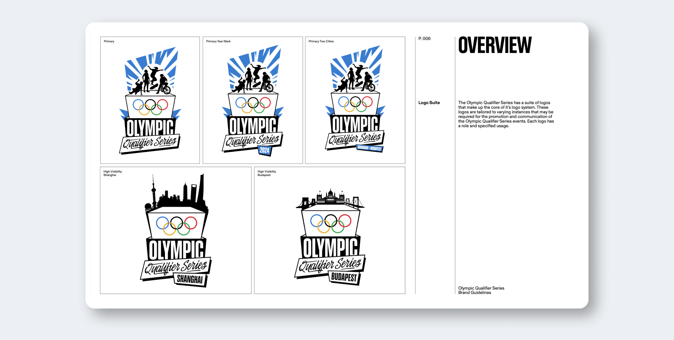
Throughout the development phase, we went through waves of refinement, tweaking and solving various challenges with the core idea. One key requirement was to incorporate a signature for each host city, which we achieved through a stylized skyline backdrop for the broadcast version of the logo.
Ideation
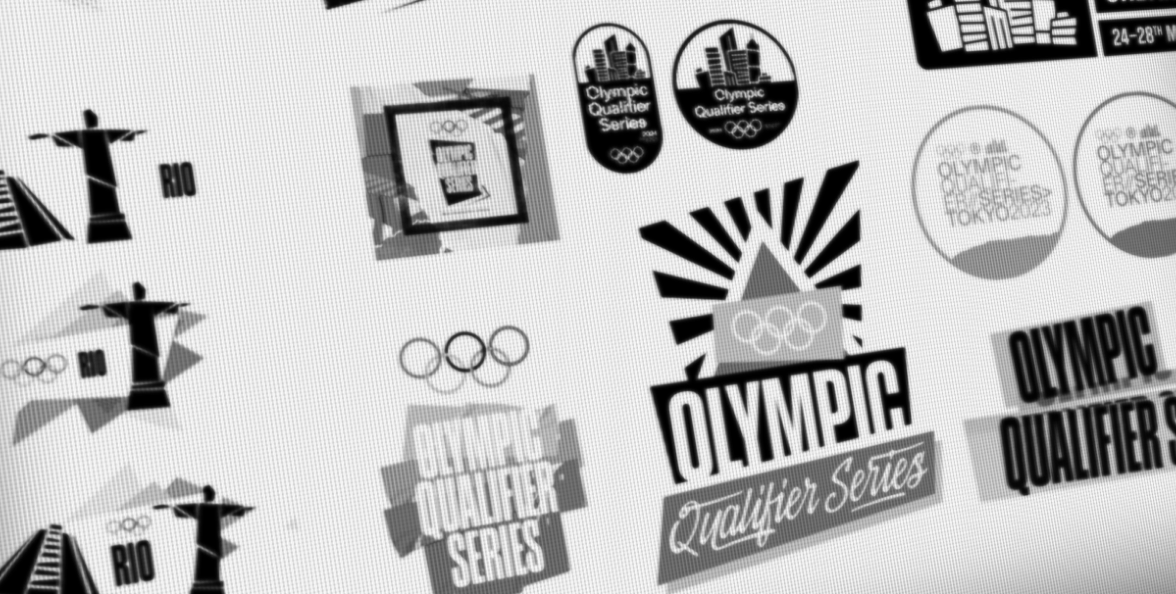
With a notional idea of what we wanted to create, we focused our ideation on the logo, the core mark that would underpin the entire brand. The logo needed to be flexible for current and future needs, allowing for different sports and qualifying events. It also needed to be localized for host cities and adaptable for broadcast, digital, print, and environmental uses. Ultimately, a "wild card" idea was chosen and developed.
Rollout
After finalizing all components, we compiled them into comprehensive guidelines. These guidelines provided detailed instructions on brand usage for consumers, agencies, third parties, and TOPS partners. Additionally, we developed overarching messaging guidelines to ensure consistent language and alignment with broader Olympic initiatives.
Brand Features
Logo Suite
The core of the brand was the logo suite, featuring variations for different contexts. The primary mark, based on the Olympic podium, included silhouettes of athletes from the four sports. Additional elements included year markers and host city names. A "High Visibility" mark was designed for broadcast, incorporating city skylines. A sticker version echoed the aesthetic of customizing skateboards and BMX bikes, reflecting urban environments.
Field of Play
Our reinterpretation of the Field of Play graphic was dynamic and abstract, designed to create moments of expression within the brand landscape. This graphic could be cropped, rotated, and torn through to enhance the brand's visual impact.
Textures
To create an urban feel, we developed textures inspired by fly posters, concrete, and paint. These textures gave the brand a distressed yet stylized appearance, marking a significant departure from the IOC's traditionally crisp and ordered aesthetic.
Taping
To ensure key messages and calls to action stood out amidst the intentional visual noise, we devised the Taping device, inspired by security tape and duct tape, serving as a disruptor within the brand's visual language.
Results
Increased Visibility
The new visual identity significantly enhanced the visibility of the OQS events, attracting a wider and more diverse audience.
Boosted Engagement
The authentic, vibrant branding resonated with urban sports communities, increasing athlete and spectator engagement.
Broader Appeal
Successfully connected with younger audiences, reversing the trend of an aging fan base and attracting a new generation of Olympic fans.
Strong Brand Alignment
Maintained strong alignment with the overall Olympic brand while introducing dynamic elements that highlighted the uniqueness of the OQS.


